Looking good Dan, a shame about the lines, I hate it when shit like that happens. I reckon you should end the stripe of colour that the text is in (in this case red) exactly where the text ends (vertically), just to clear up the communication at the top of the H and particularly the bottom of the d.
My names Dan Morrison. I'm currently sitting a Bachelor of Design at Massey University in Wellington, New Zealand. Heaps good design is a blog for all the random design related shenanigans I get up to, both at uni and outside and is so good its grammatically incorrect.
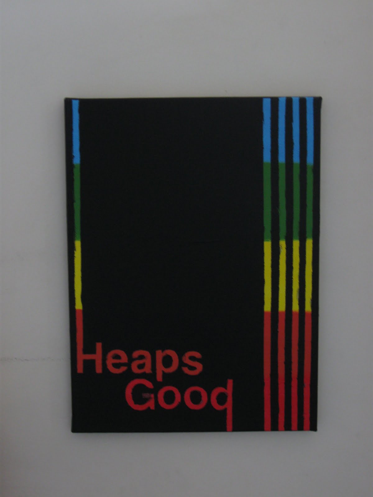

Looking good Dan, a shame about the lines, I hate it when shit like that happens. I reckon you should end the stripe of colour that the text is in (in this case red) exactly where the text ends (vertically), just to clear up the communication at the top of the H and particularly the bottom of the d.
ReplyDelete